#1 Knowledge-Centric Software Engineering Intelligence
Measure the Real Impact of AI
on Engineering Efficiency
KEDEHub quantifies whether AI actually reduces the knowledge gaps developers must bridge to deliver working software.
Patented, research-backed technology that analyzes production code to measure knowledge gaps in bits of information.
Not AI usage. Not lines of code. Not commits. Not PR throughput. Not surveys. True efficiency.


Who is this for?

Chief Technology Officers
You can explain AI impact to the board with evidence, not stories


What you get

Credibility in AI discussions
- Speak with confidence about what AI changed — and what it didn’t
- Replace anecdotes and proxy metrics with a defensible evidence that shifts AI conversations from tools to efficiency economics
- Answer questions with a concise narrative that resonates with the entire leadership team
Control over AI investment decisions
- Know where AI improves efficiency — and where it doesn’t
- Compare AI impact across teams, domains, technologies, and time
- Scale, pause, or redirect AI investment with confidence


Governance without micromanagement
- Maintain oversight of engineering efficiency without policing teams .
- Surface structural inefficiencies before they become delivery risks
- Equip the engineering leaders with objective data to confidently execute their strategies
When you get results
In hours, not quarters.
KEDEHub works on your existing engineering history. There is no pilot period, behavioral change program, or waiting for new data to accumulate.
Immediate, visual insight into how engineering efficiency has evolved over time
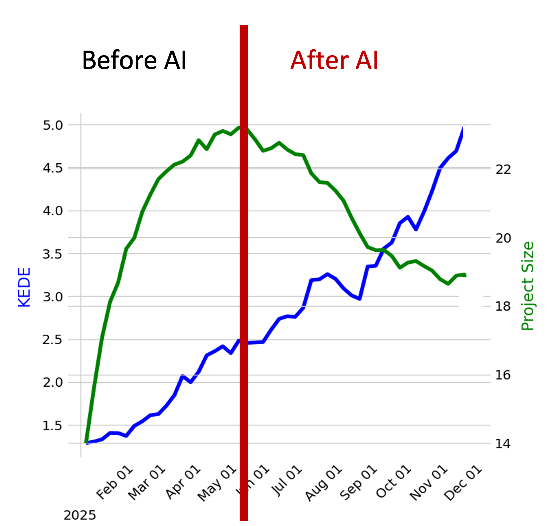
- The diagram showcases the relationship between an organization's capability and its size over selected timeframe
- The x-axis delineates time in months,
- The blue line offers a visual trajectory of the organization's average capability variations over the period.
- The green line provides a representation of the company's growth or reduction in size, with each point signifying the total number of developers contributing during a specific week.
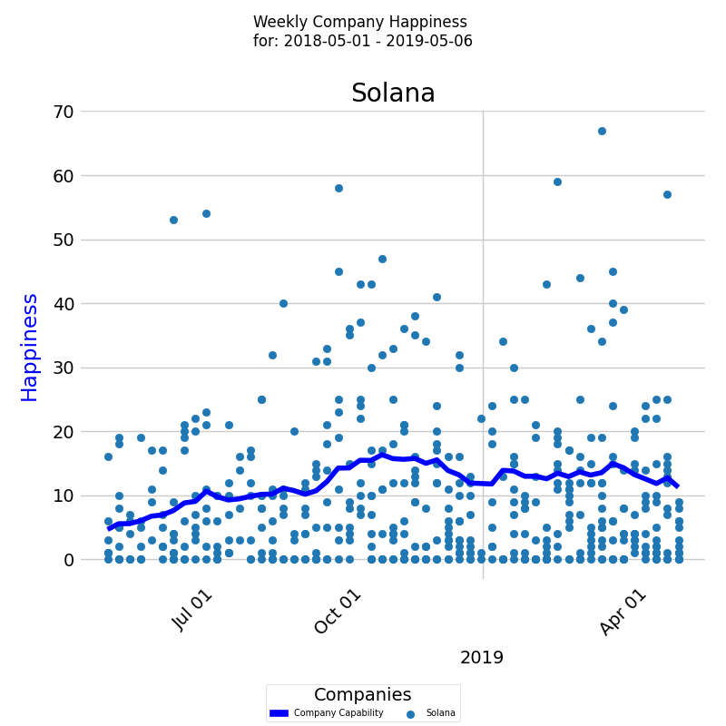
Company Happiness Over Time
- The diagram visually tracks Happiness level for the company over a selected period
- On the x-axis, the diagram displays the week dates, while on the y-axis, it shows the Happiness levels.
- Each colored dot represents an individual developer's Happiness level, and the dark blue line represents the average Happiness level for all developers.
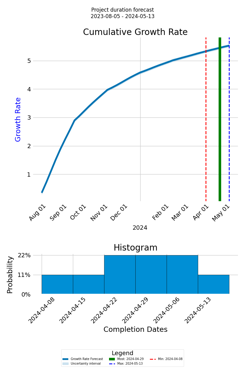
Forecasting Project Completion Time
- The forecast graph depicts the cumulative growth rate of anticipated knowledge discovery via a thick blue line, with the x-axis showing the project timeline and the y-axis indicating the cumulative growth.
- Distinct lines, including green for the most probable completion date, dashed red for the earliest, and dashed blue for the latest, offer a range of possible outcomes.
- Below the graph, a histogram visualizes the probable completion dates and their likelihood, presenting an overview of potential timelines.
How It Works

KEDEHub platform has three main functions: analyzing Git repositories, calculating Knowledge-centric metrics, and presenting results visually.
KEDEHub is available in both SaaS and On-Premise versions.
Analysis is conducted on local clones of Git repositories.
- Your source code and commit messages remain secure on your premises, ensuring the protection of your intellectual property.
- No Intellectual property (IP) is captured through the analysis of the source code and commit messages.
- The analysis is carried out by an open-source agent, which can be found here.
No Disruptions for Developers
- There is no need for software installations on developers' computers.
- Developers are not required to provide any additional input.
- Consent from developers is not necessary.
Case studies
Getting started


