Stuck in the Middle of the AI Conversation
AI is already part of your team’s daily work. Some tasks move faster. Others don’t. The overall impact is unclear. Leadership expects AI to improve efficiency.
-
 Existing metrics such as DORA, SPACE, DevEx, velocity, throughput, or pull requests describe activity and sentiment, not efficiency.
-
AI pilots, surveys, and vendor usage dashboards provide signals, not evidence.
-
As a result, AI impact is explained with anecdotes instead of defensible metrics.
You’re responsible for improving efficiency with AI, without a credible way to attribute its real impact.
A System-Level View of Engineering Efficiency
A Knowledge-Centric Software Engineering Intelligence Platform able to answer the question: Did AI reduce the knowledge and effort required to deliver working software?
- Quantifies whether AI reduces the knowledge gaps developers must bridge during real delivery work.
- Works across teams, domains, technologies, time, and AI tools.
- Uses production source code as ground truth, not surveys or activity.
KEDEHub doesn’t infer AI impact. It measures it — accurately, comparably, and defensibly.
What you will gain

Credibility in AI Impact Conversations
- Speak with confidence about what AI changed — and what it didn’t
- Defend your team when AI isn’t the limiting factor
- Answer questions with a concise narrative that resonates with the entire leadership team
Clarity About Where Efficiency Is Lost or Gained
- See whether task-level AI gains actually compound at the process level
- Distinguish AI impact from product churn, rework, or coordination friction
- Understand why efficiency improves or stalls — without blaming people


Credibility to Improve the Team
- Maintain oversight of engineering efficiency without policing and micromanagement.
- Surface structural inefficiencies before they become delivery risks
- Create alignment without turning metrics into judgment
When you get results
In hours, not quarters.
KEDEHub works on your existing engineering history. There is no pilot period, behavioral change program, or waiting for new data to accumulate.
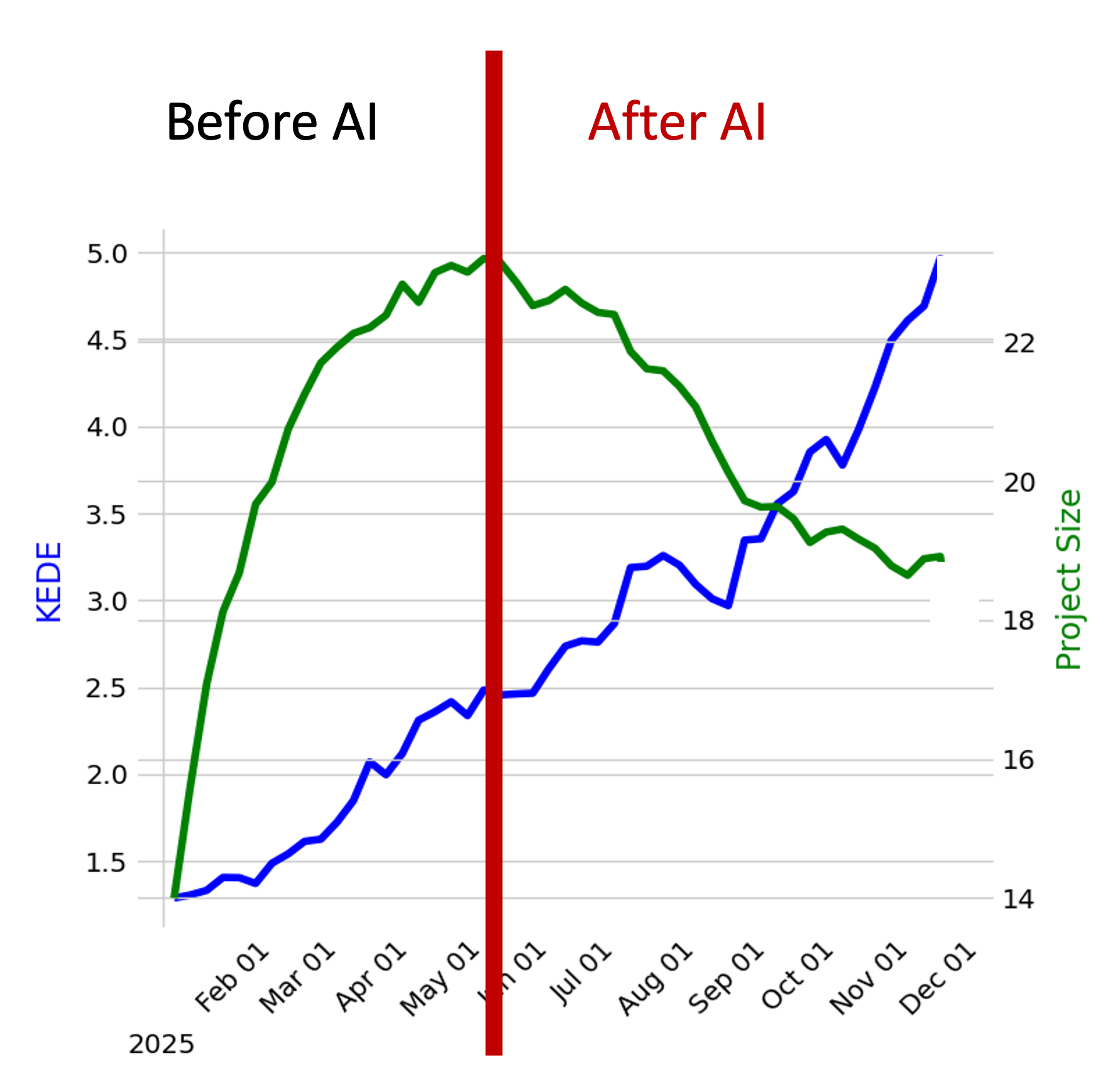
Immediate, visual insight into how engineering efficiency has evolved over time
- The diagram showcases the relationship between an organization's efficiency and its size over distinct period
- The x-axis delineates time in months,
- The blue line offers a visual trajectory of the organization's average efficien variations over the period.
- The green line provides a representation of the company's growth or reduction in size, with each point signifying the total number of developers contributing during a specific week.
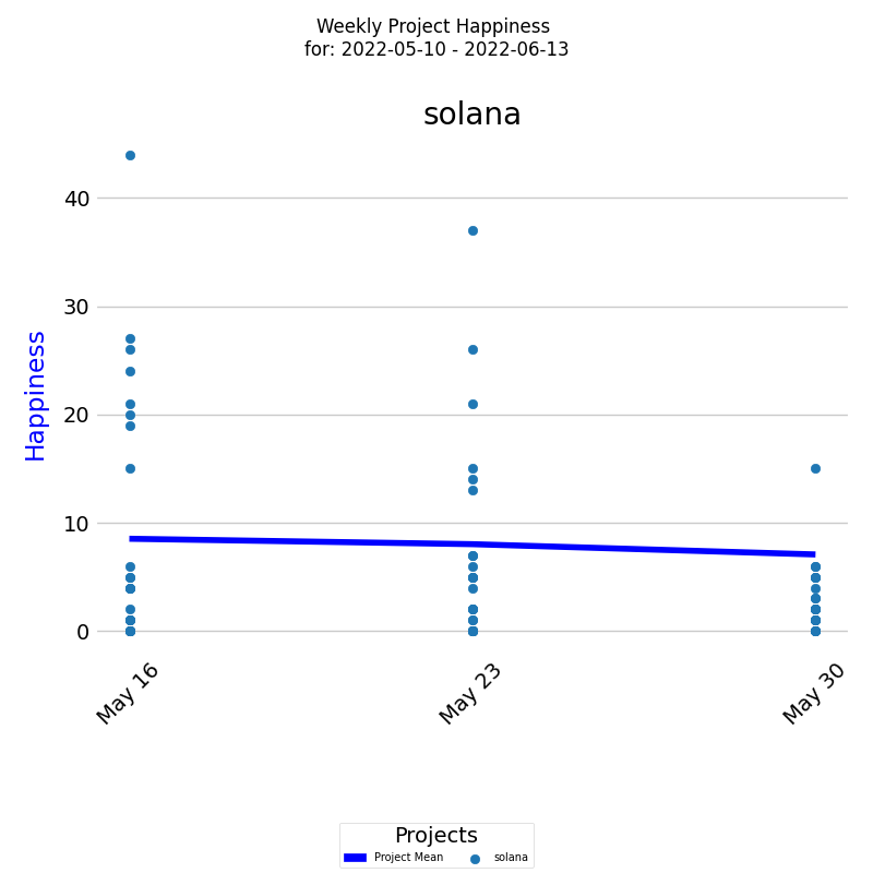
Project Happiness Over Time
- The diagram visually tracks Happiness level for a project over a selected period
- On the x-axis, the diagram displays the week dates, while on the y-axis, it shows the Happiness levels.
- Each colored dot represents an individual developer's weekly Happiness level, and the dark blue line represents the average Happiness level for all developers.
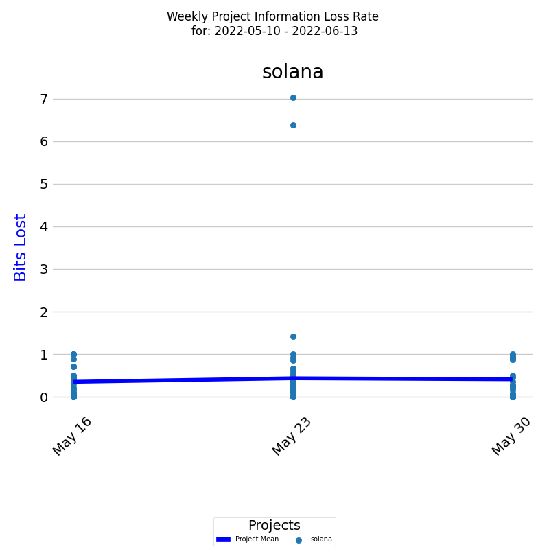
Project Rework (Information Loss Rate) Over Time
- The diagram presents a project's Rework (Information Loss Rate) over a selected period.
- On the x-axis, the diagram displays the week dates, while on the y-axis, it shows the rework levels in bits of information lost.
- Each colored dot represents an individual developer's rework level, and the dark blue line represents the average rework level for all developers.
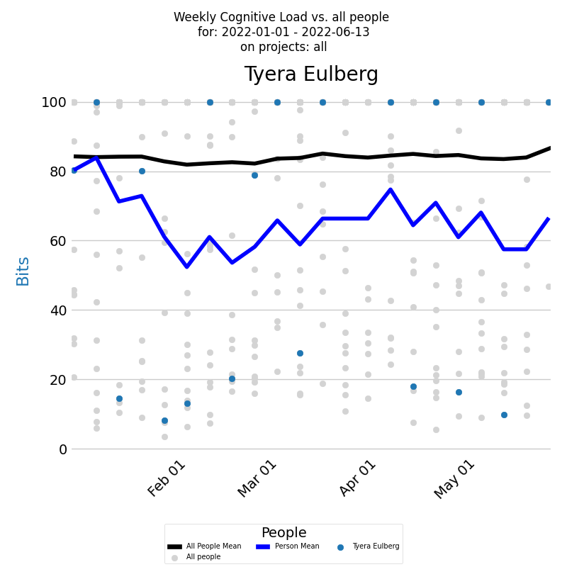
Developer Cognitive Load Over Time
- The diagram presents a developer's Cognitive load for a selected period across all projects.
- The x-axis displays the week dates, while the y-axis shows the Codnitive Load values.
- Each week's Codnitive Load level is represented by a blue dot and the blue line represents the average.
- You can compare a developer's Cognitive Load to all developers who contributed during the selected period. Individual loads are marked by light gray dots, and the average is depicted by the black line.
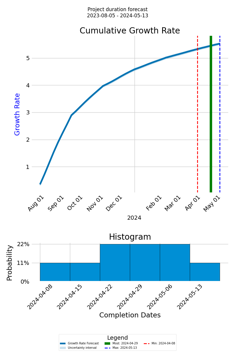
Forecasting Project Completion Time
- The forecast graph depicts the cumulative growth rate of anticipated knowledge discovery via a thick blue line, with the x-axis showing the project timeline and the y-axis indicating the cumulative growth.
- Distinct lines, including green for the most probable completion date, dashed red for the earliest, and dashed blue for the latest, offer a range of possible outcomes.
- Below the graph, a histogram visualizes the probable completion dates and their likelihood, presenting an overview of potential timelines.
How It Works

KEDEHub platform has three main functions: analyzing Git repositories, calculating Knowledge-centric metrics, and presenting results visually.
KEDEHub is available in both SaaS and On-Premise versions.
Analysis is conducted on local clones of Git repositories.
- Your source code and commit messages remain secure on your premises, ensuring the protection of your intellectual property.
- No Intellectual property (IP) is captured through the analysis of the source code and commit messages.
- The analysis is carried out by an open-source agent, which can be found here.
No Disruptions for Developers
- There is no need for software installations on developers' computers.
- Developers are not required to provide any additional input.
- Consent from developers is not necessary.
Case studies
Getting started


