Ensure developer joy and realized potential
on your projects
through Knowledge-Centric insights
What you get

Maximized Productivity
- Boost Productivity: Measure and optimize the efficiency of knowledge acquisition and application to deliver value faster.
- Minimize Waste: Identify high information loss rate areas and take corrective actions to reduce errors and rework.
- Improve Capability: Benchmark efficiency and elevate the existing talent of your projects, driving consistent growth and performance.
Improved Developer Experience
- Foster a Positive Work Environment: Continuously monitor and enhance developer happiness to build a motivated and enthusiastic projects teams.
- Achieve Reduced Cognitive Load: Quantify the mental effort tasks require and streamline them. Proper task allocation ensures developers are not overwhelmed, leading to improved efficiency.
- Increase Collaboration: Understand how efficiently information is acquired with respect to active developers. This ensures communication flows smoothly, leading to cohesive teamwork.


Leadership Credibility
- Demystify Data with Intuitive Metrics: Use metrics that resonate with and are easily understood by the entire leadership team, ensuring you and your boss will be in agreement over data and analysis. .
- Bridge Developer Experience with Business Productivity: Link the well-being of developers to economic results, highlighting the direct impact of a motivated projects teams on business outcomes.
- Validate the Impact of their Management Practices: With objective data at hand, confidently showcase the efficacy of your management practices. This evidence-backed approach enables continuous improvement, leading to sustained success.
When you get results
In just hours, you will transform the extensive history of your projects into immediate, visual insights with comprehensive diagrams.
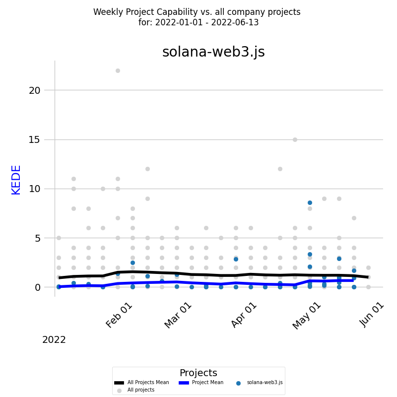
Project Capability Over Time
- The diagram showcases a project's capability over a distinct period.
- The x-axis delineates time in weeks, while the y-axis displays the weekly KEDE values.
- Each colored dot represents an individual developer's Weekly KEDE, with the dark blue line indicating the average weekly KEDE for the entire project.
- For a broader comparison, the project's capability can be juxtaposed against the company's average, represented by the black line. Every light gray dot depicts the Weekly KEDE of other contributors during the selected period.
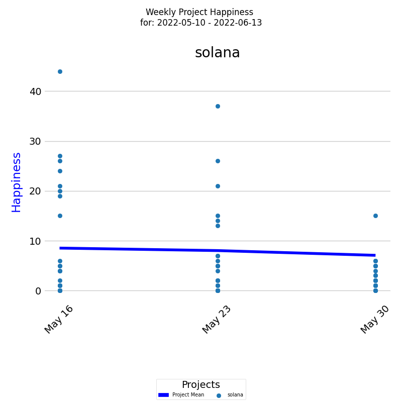
Project Happiness Over Time
- The diagram visually tracks Happiness level for a project over a selected period
- On the x-axis, the diagram displays the week dates, while on the y-axis, it shows the Happiness levels.
- Each colored dot represents an individual developer's weekly Happiness level, and the dark blue line represents the average Happiness level for all developers.
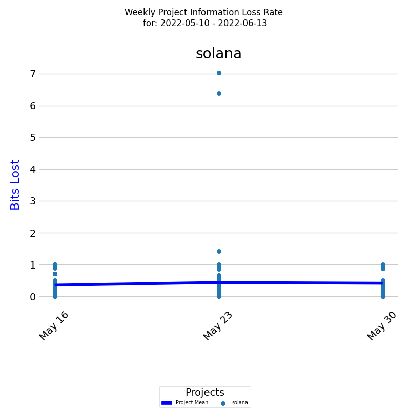
Project Rework (Information Loss Rate) Over Time
- The diagram presents a project's Rework (Information Loss Rate) over a selected period.
- On the x-axis, the diagram displays the week dates, while on the y-axis, it shows the rework levels in bits of information lost.
- Each colored dot represents an individual developer's rework level, and the dark blue line represents the average rework level for all developers.
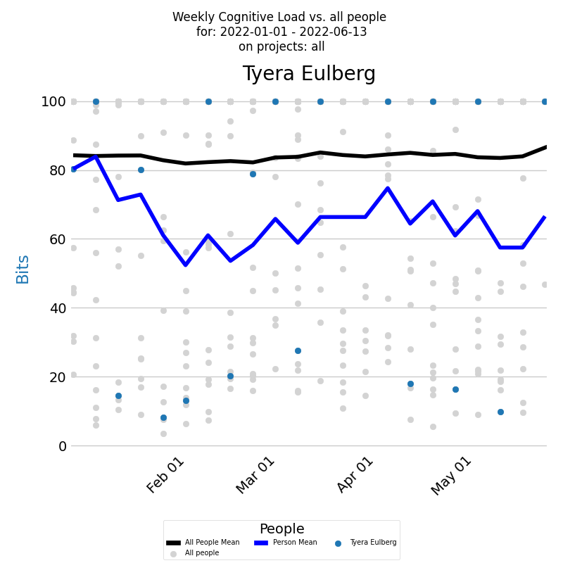
Developer Cognitive Load Over Time
- The diagram presents a developer's Cognitive load for a selected period across all projects.
- The x-axis displays the week dates, while the y-axis shows the Codnitive Load values.
- Each week's Codnitive Load level is represented by a blue dot and the blue line represents the average.
- You can compare a developer's Cognitive Load to all developers who contributed during the selected period. Individual loads are marked by light gray dots, and the average is depicted by the black line.
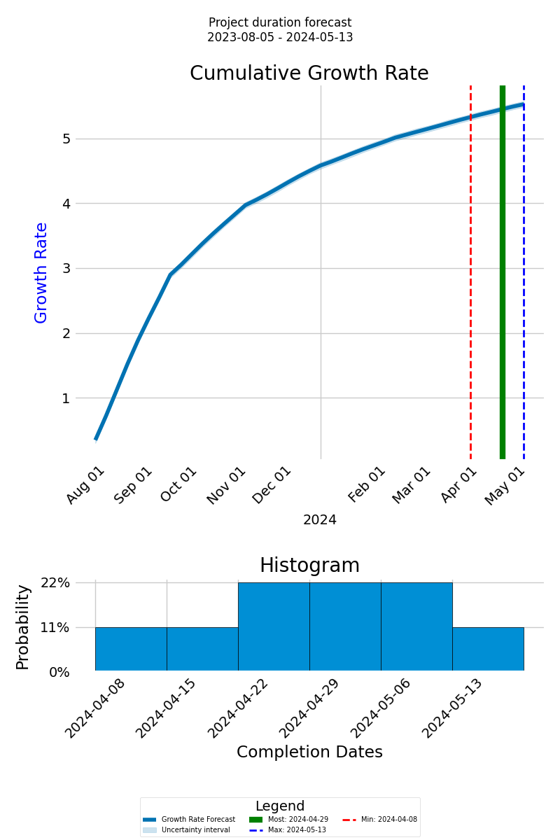
Forecasting Project Completion Time
- The forecast graph depicts the cumulative growth rate of anticipated knowledge discovery via a thick blue line, with the x-axis showing the project timeline and the y-axis indicating the cumulative growth.
- Distinct lines, including green for the most probable completion date, dashed red for the earliest, and dashed blue for the latest, offer a range of possible outcomes.
- Below the graph, a histogram visualizes the probable completion dates and their likelihood, presenting an overview of potential timelines.
How It Works

KEDEHub platform has three main functions: analyzing Git repositories, calculating Knowledge-centric metrics, and presenting results visually.
KEDEHub is available in both SaaS and On-Premise versions.
Analysis is conducted on local clones of Git repositories.
- Your source code and commit messages remain secure on your premises, ensuring the protection of your intellectual property.
- No Intellectual property (IP) is captured through the analysis of the source code and commit messages.
- The analysis is carried out by an open-source agent, which can be found here.
No Disruptions for Developers
- There is no need for software installations on developers' computers.
- Developers are not required to provide any additional input.
- Consent from developers is not necessary.
Case studies
Getting started


