Verify the Real Economics
of AI-Enabled
Outsourcing Vendors
Outsourcing Economics Lose Clarity Under AI
CTOs who work with software development vendors face a structural challenge: as AI changes how software is produced, it becomes harder to verify whether vendor effort, staffing, and cost still align with delivery outcomes.
-
 Clients pay for outcomes, but visibility into how AI engineering efficiency gains are shared is limited.
-
Verifying utilization, efficiency, and real contribution requires intrusive oversight or costly manual audits.
-
Lagging and proxy metrics describe activity and outputs, not whether engineering capability is efficiently utilized.
Clients cannot tell whether the expected AI-driven efficiency gains translate into fair economics and improved performance.
Independent, Code-Based Verification
KEDEHub is a Knowledge-Centric Software Engineering Intelligence Platform that allows client CTOs to independently verify engineering efficiency and utilization using the source code they already own.
- Patented technology with no software installations on developers' computers or additional vendor consent,
- Client-side verification without surveillance, micromanagement or process intrusion.
- Objective evidence derived from delivered code, not narratives or dashboards.
KEDEHub does not replace governance or audits. It strengthens them with objective, repeatable evidence.
What you will gain

Better Project Outcomes
- Detect efficiency and capability shifts early—before schedules slip
- Understand whether AI and staffing changes actually reduce effort required to deliver value
- Identify Waste that inflate timelines and budgets
Transparency and Control
- Track engineering capacity utilization trends over the full project lifecycle
- Benchmark and compare capability and efficiency across engagements using the same objective baseline
- Ground vendor discussions in evidence when making planning, renewals, and scaling decisions


Better Alignment With Your Goals
- Focus on efficiency and capability, not surface-level productivity signals
- More constructive vendor collaboration by replacing suspicion with shared evidence and clearer expectations
- Confident, data-driven decisions when you scale, renegotiate, or redirect outsourcing investments
When you get results
In hours, not quarters.
KEDEHub works on your existing engineering history. There is no pilot period, behavioral change program, or waiting for new data to accumulate.
Immediate, visual insight into how engineering efficiency has evolved over time
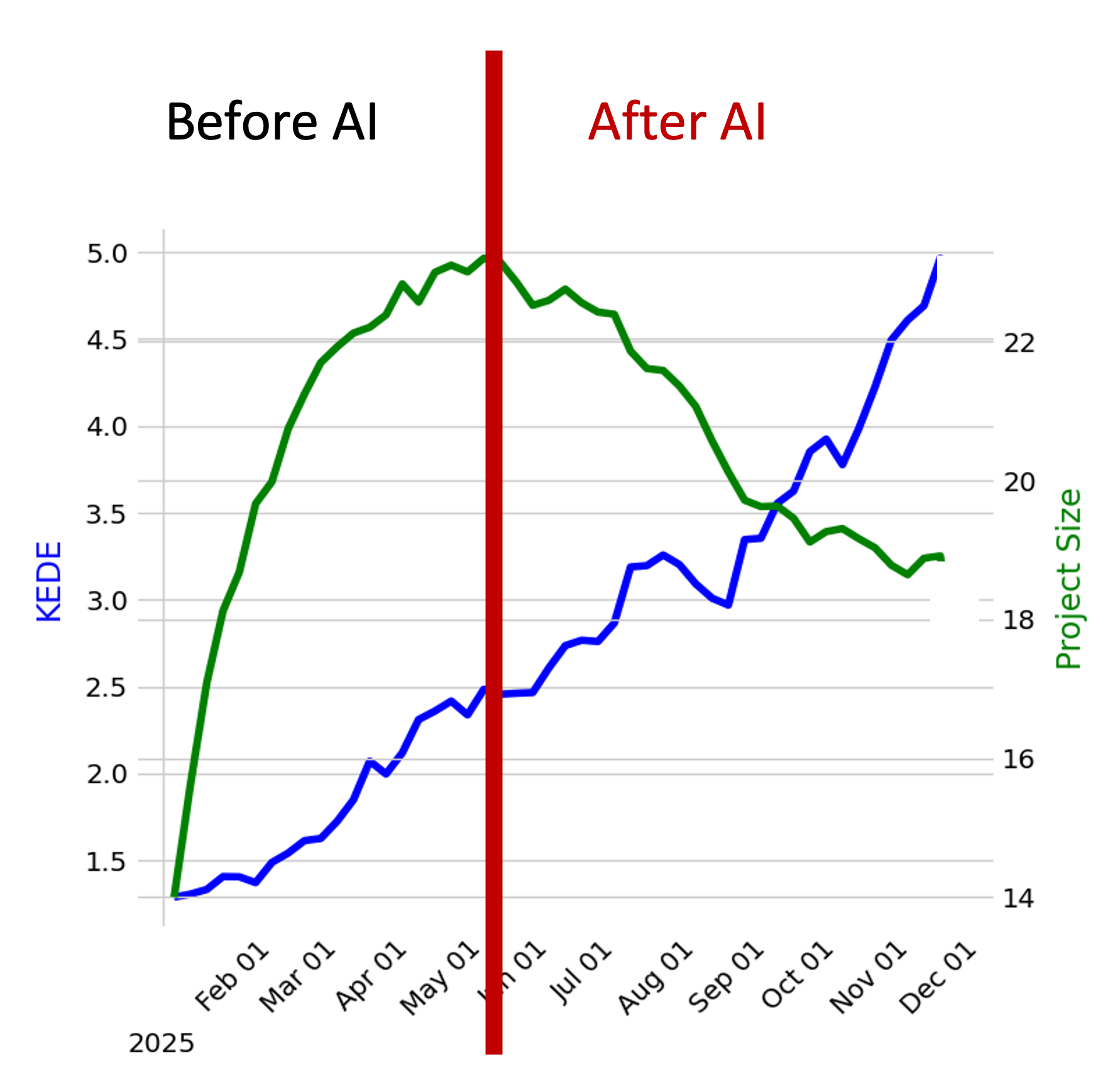
- The diagram showcases the relationship between an organization's efficiency and its size over distinct period
- The x-axis delineates time in months,
- The blue line offers a visual trajectory of the organization's average efficien variations over the period.
- The green line provides a representation of the company's growth or reduction in size, with each point signifying the total number of developers contributing during a specific week.
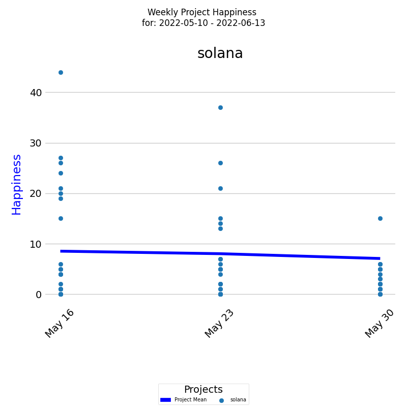
Project Happiness Over Time
- The diagram visually tracks Happiness level for a project over a selected period
- On the x-axis, the diagram displays the week dates, while on the y-axis, it shows the Happiness levels.
- Each colored dot represents an individual developer's weekly Happiness level, and the dark blue line represents the average Happiness level for all developers.
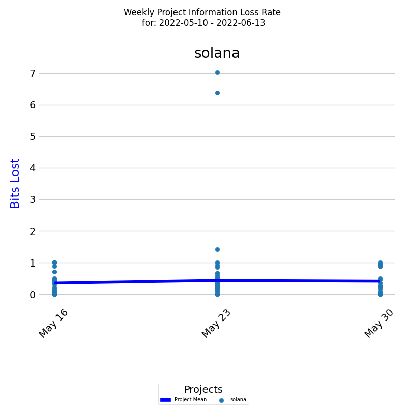
Project Rework (Information Loss Rate) Over Time
- The diagram presents a project's Rework (Information Loss Rate) over a selected period.
- On the x-axis, the diagram displays the week dates, while on the y-axis, it shows the rework levels in bits of information lost.
- Each colored dot represents an individual developer's rework level, and the dark blue line represents the average rework level for all developers.
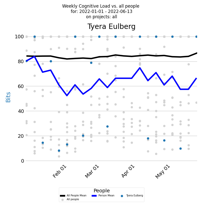
Developer Cognitive Load Over Time
- The diagram presents a developer's Cognitive load for a selected period across all projects.
- The x-axis displays the week dates, while the y-axis shows the Codnitive Load values.
- Each week's Codnitive Load level is represented by a blue dot and the blue line represents the average.
- You can compare a developer's Cognitive Load to all developers who contributed during the selected period. Individual loads are marked by light gray dots, and the average is depicted by the black line.
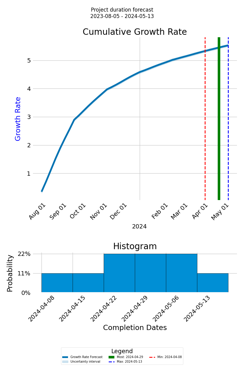
Forecasting Project Completion Time
- The forecast graph depicts the cumulative growth rate of anticipated knowledge discovery via a thick blue line, with the x-axis showing the project timeline and the y-axis indicating the cumulative growth.
- Distinct lines, including green for the most probable completion date, dashed red for the earliest, and dashed blue for the latest, offer a range of possible outcomes.
- Below the graph, a histogram visualizes the probable completion dates and their likelihood, presenting an overview of potential timelines.
How It Works

KEDEHub platform has three main functions: analyzing Git repositories, calculating Knowledge-centric metrics, and presenting results visually.
KEDEHub is available in both SaaS and On-Premise versions.
Analysis is conducted on local clones of Git repositories.
- Your source code and commit messages remain secure on your premises, ensuring the protection of your intellectual property.
- No Intellectual property (IP) is captured through the analysis of the source code and commit messages.
- The analysis is carried out by an open-source agent, which can be found here.
No Disruptions for Developers
- There is no need for software installations on developers' computers.
- Developers are not required to provide any additional input.
- Consent from developers is not necessary.
Getting started


